dry dock brewing co.
Brand Evolution—Packaging—Hand Lettering
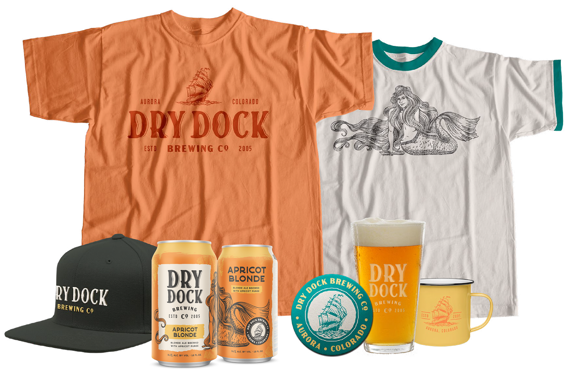
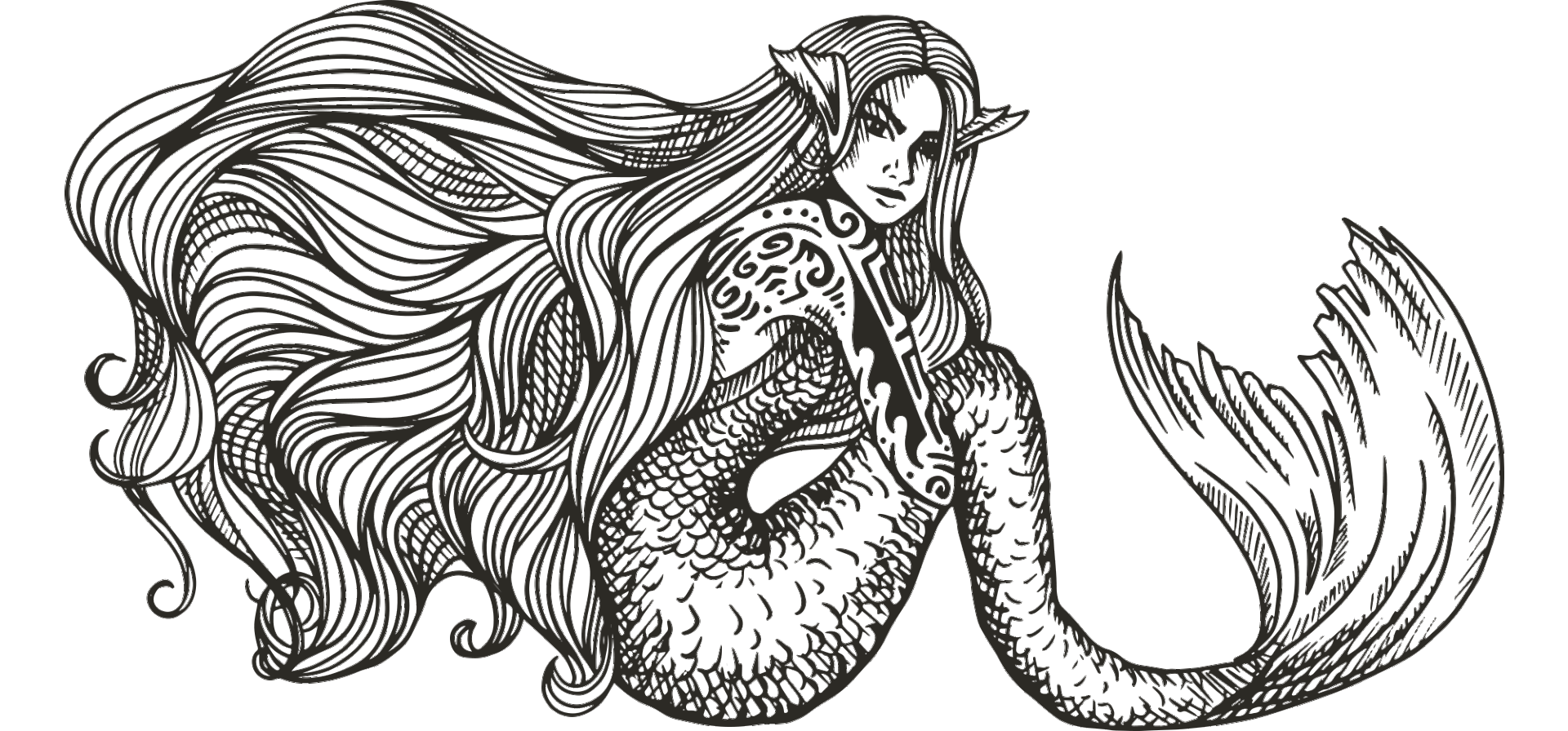
Custom Illustration—Collateral
Custom Illustration—Collateral
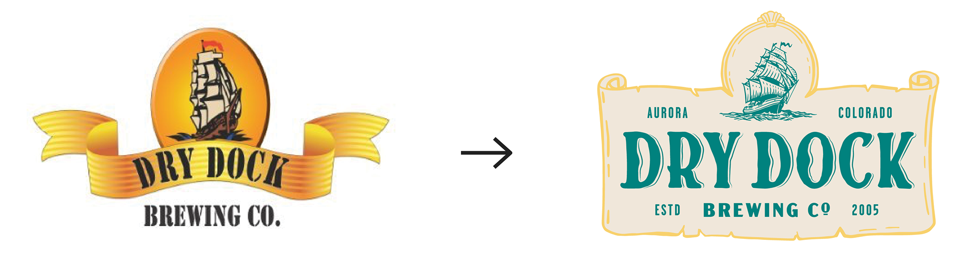
In 2005, they were the first brewery to open in Aurora, Colorado. Starting with home brewing roots, they’ve expanded into the award-winning community gathering place they are today. With larger distribution goals in mind, they came to Blindtiger Design in need of a brand and packaging refresh to keep up with new competitors in a growing market. Our goal was to evolve their brand with an updated look that still maintains the nautical core their loyal fan-base loves.
logo rebrand
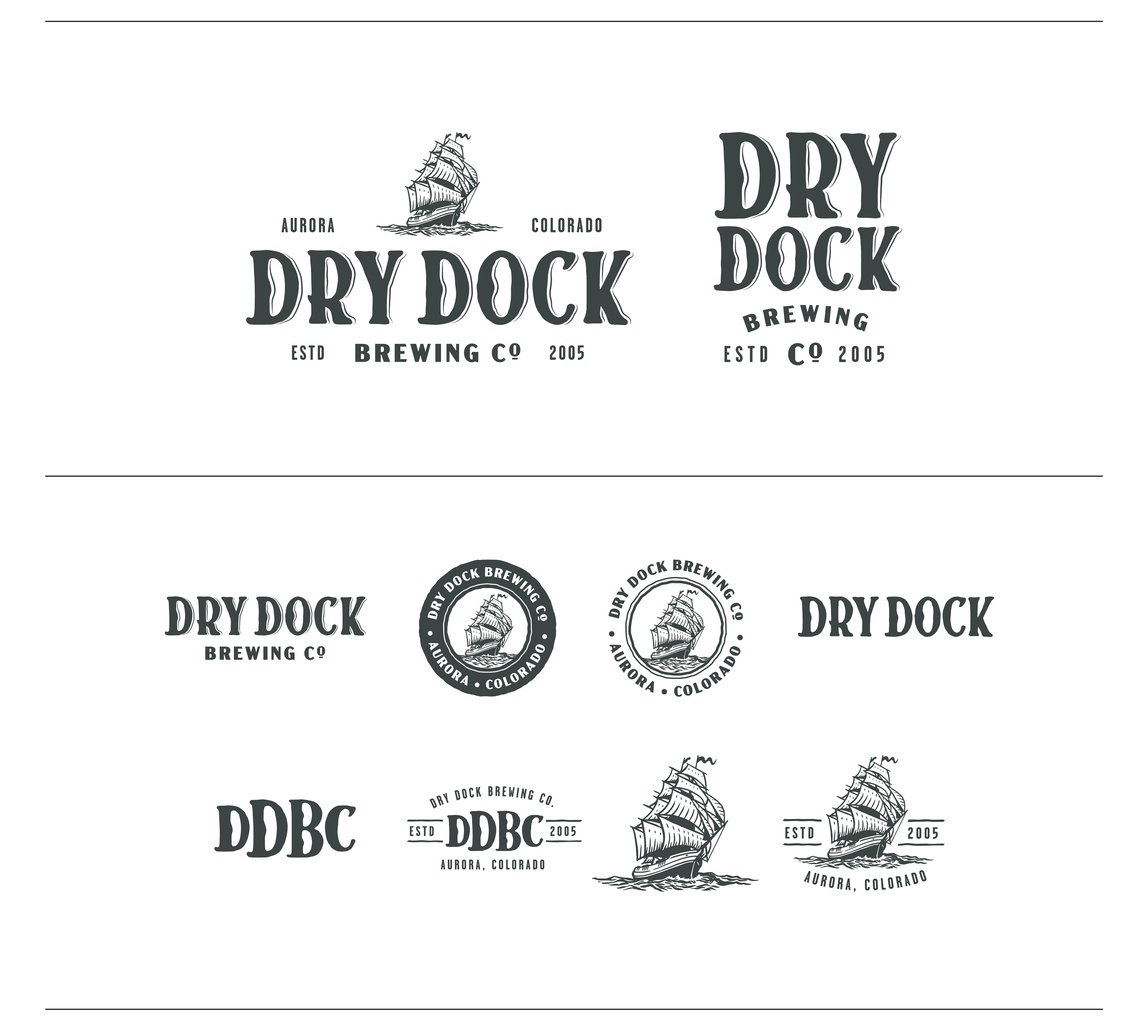
expanded logo system
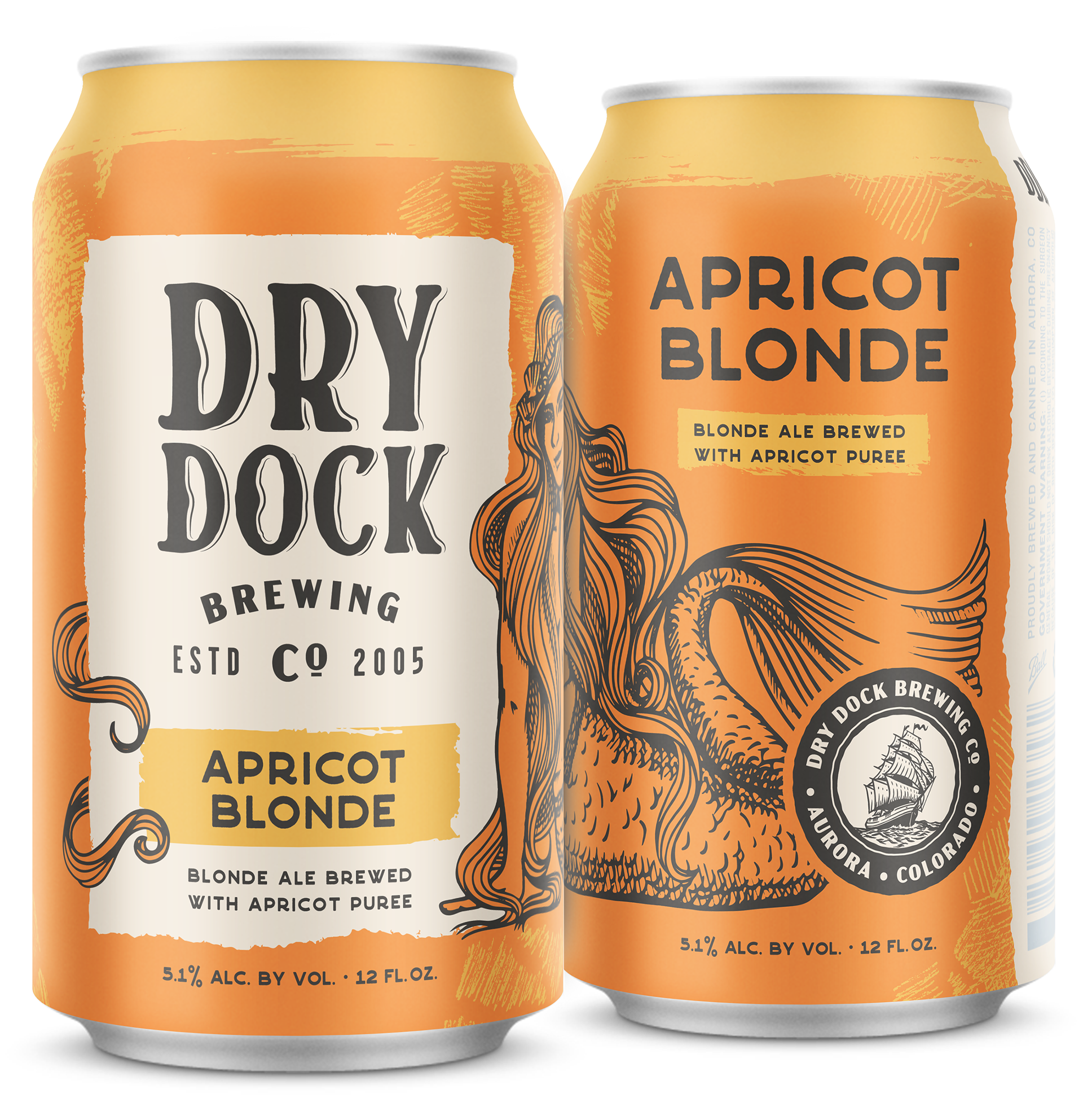
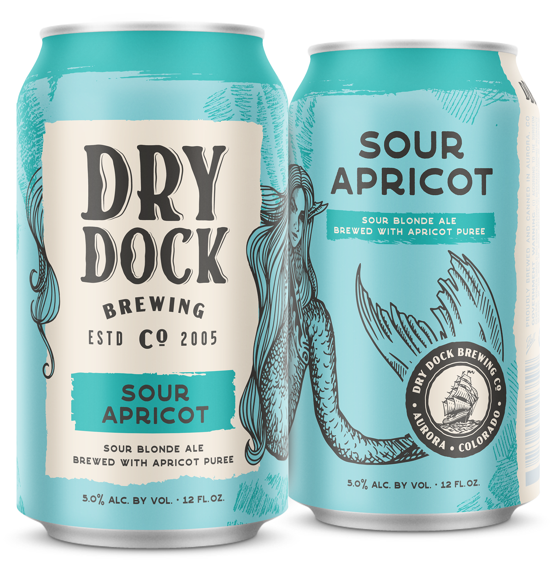
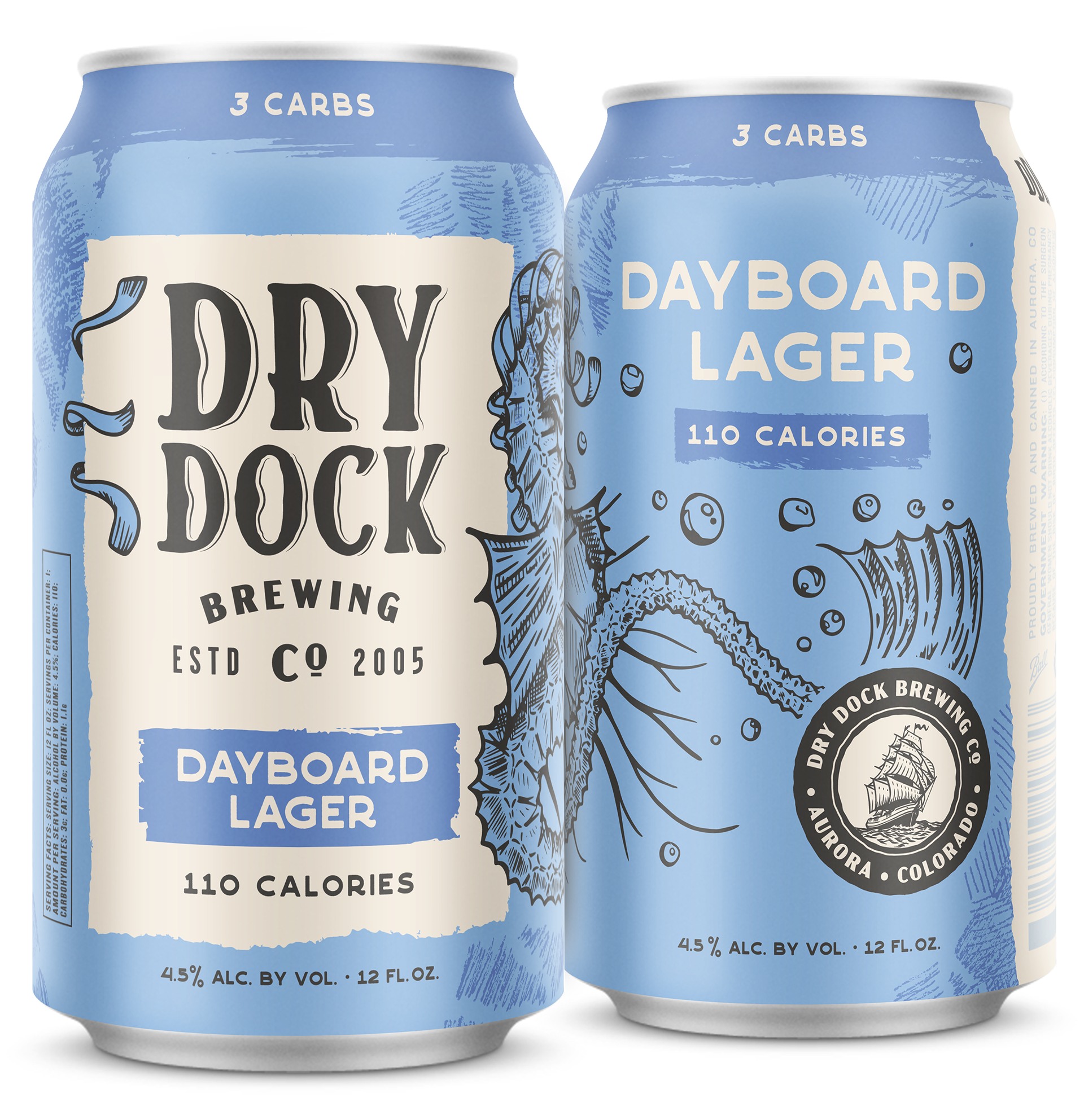
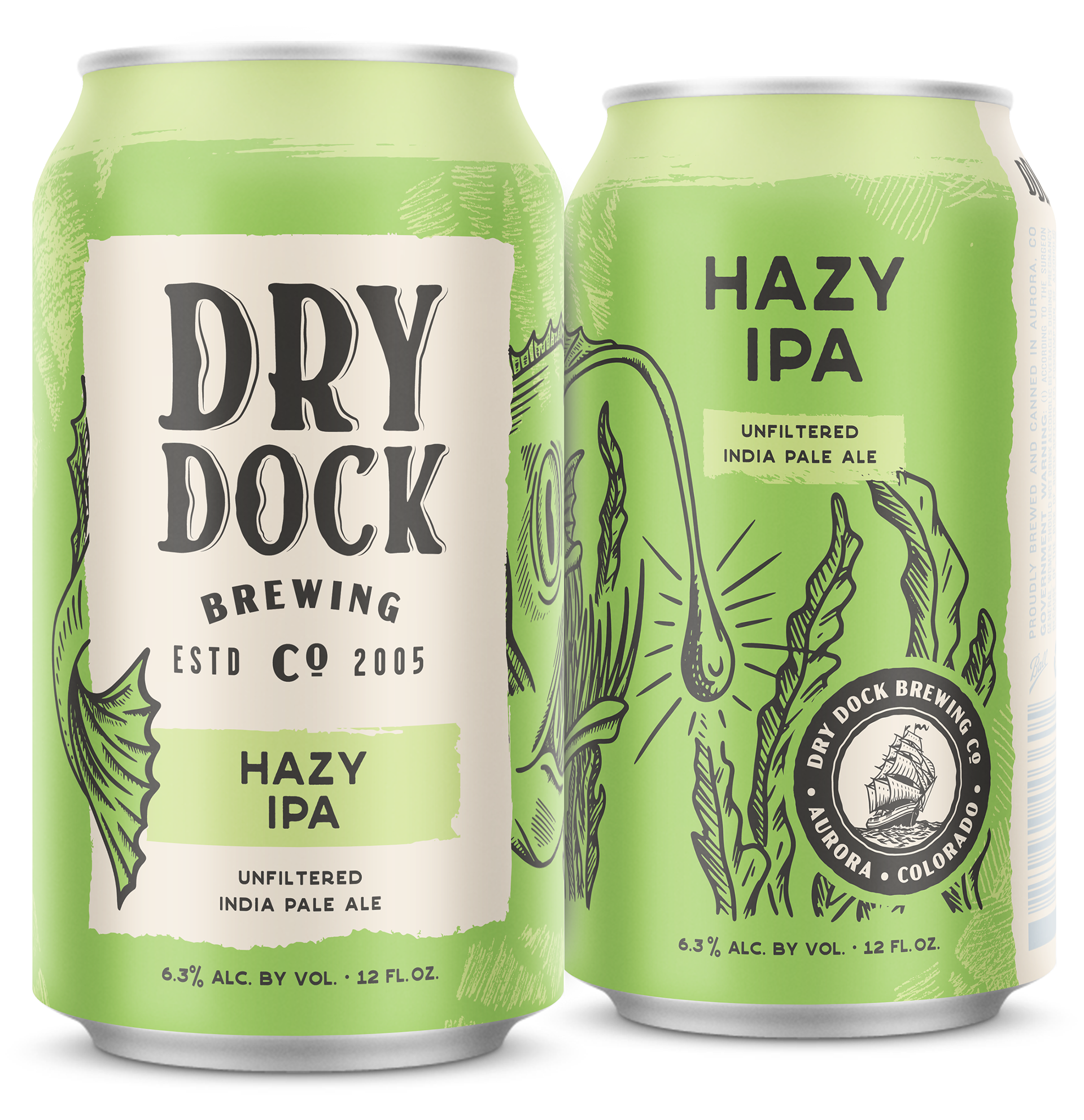
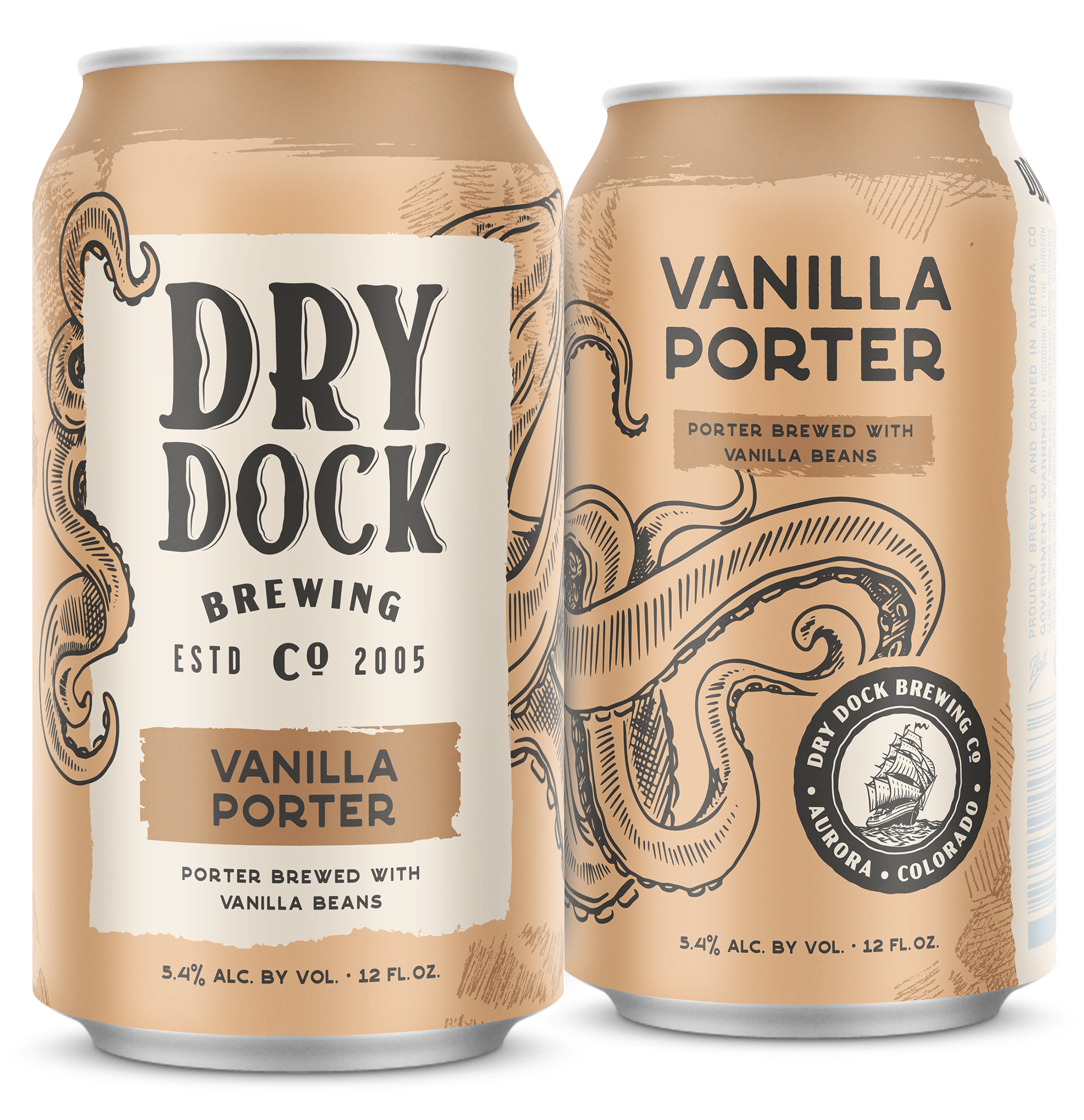
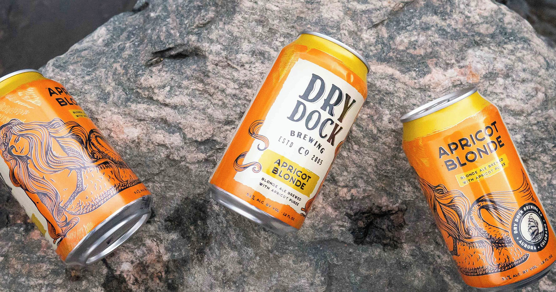
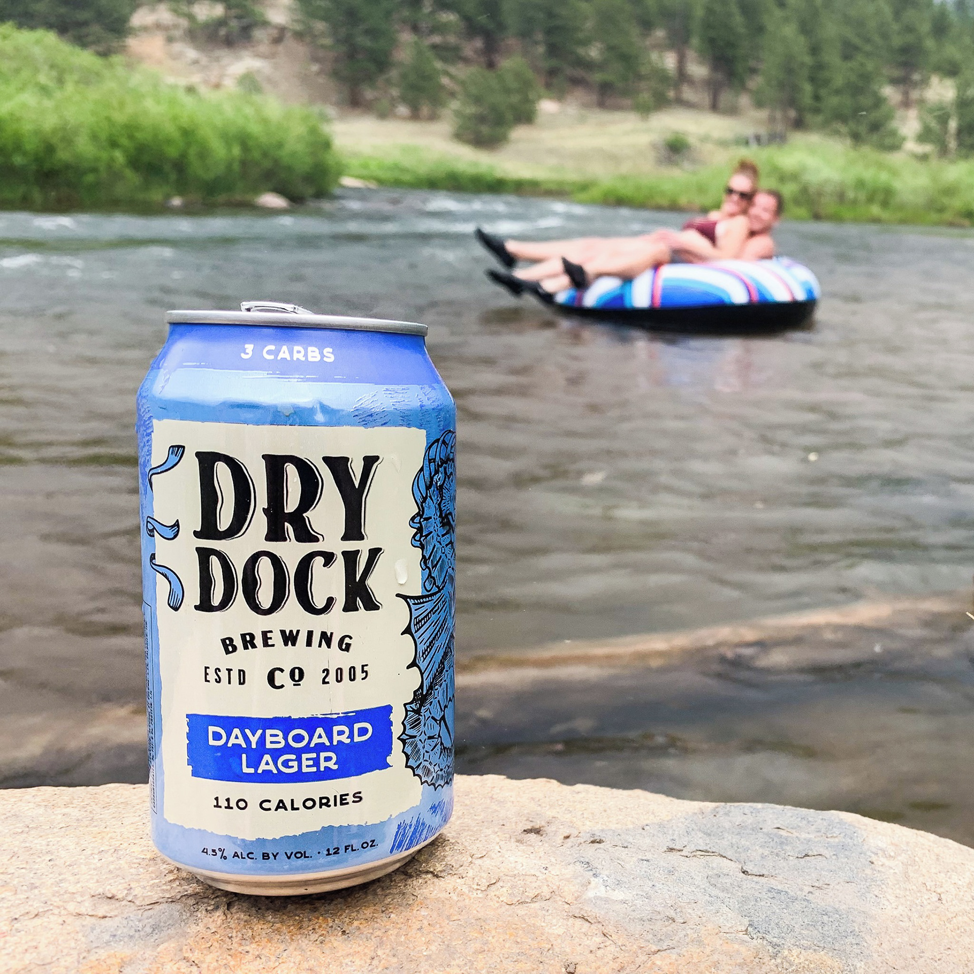
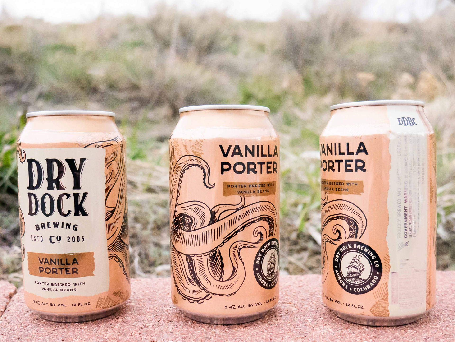
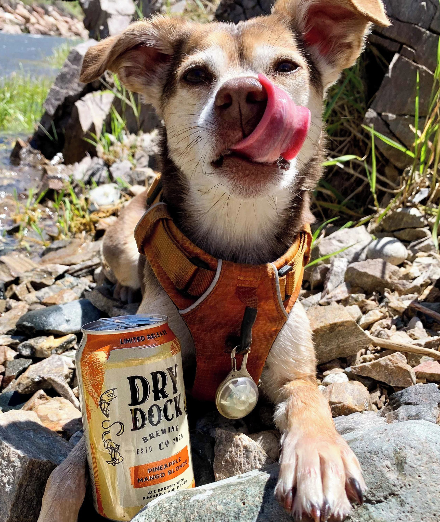
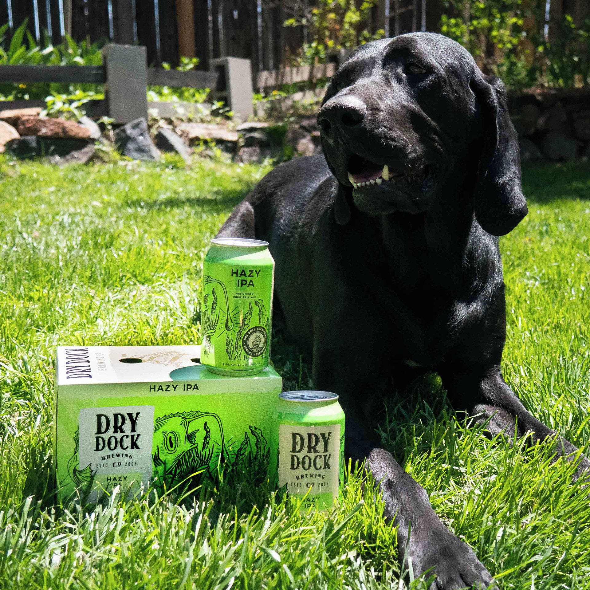
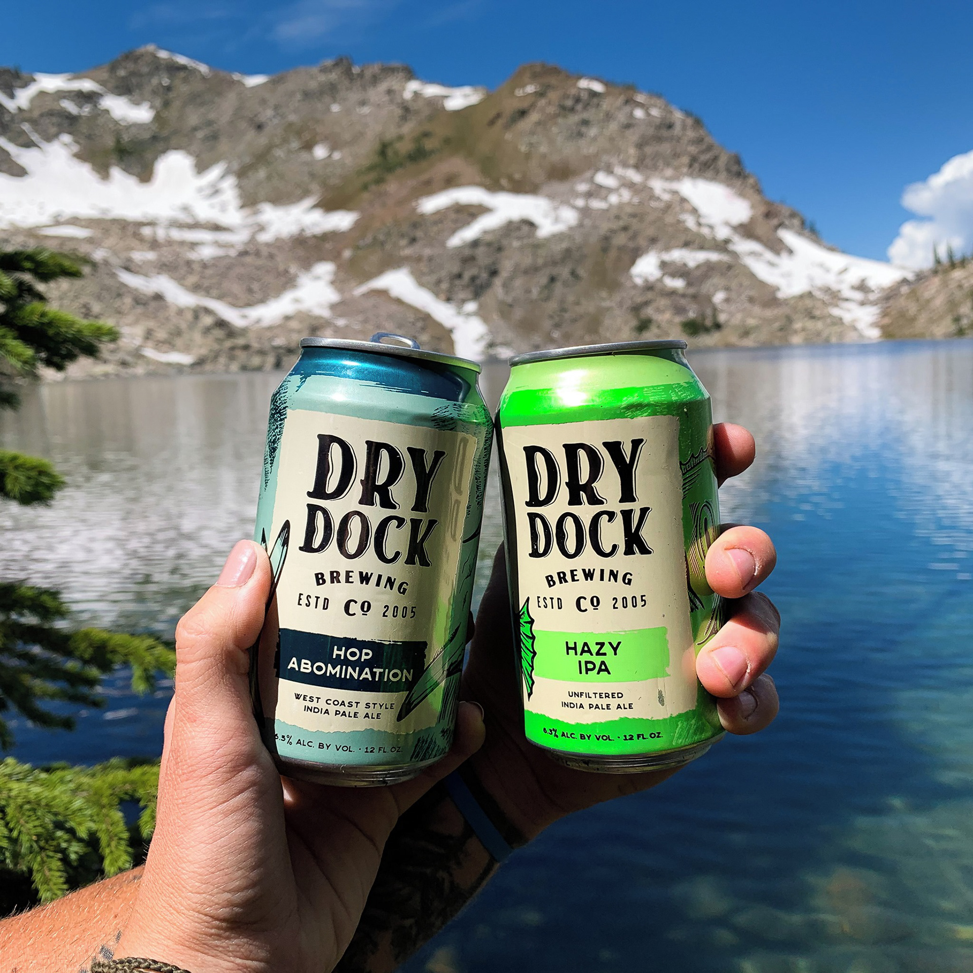
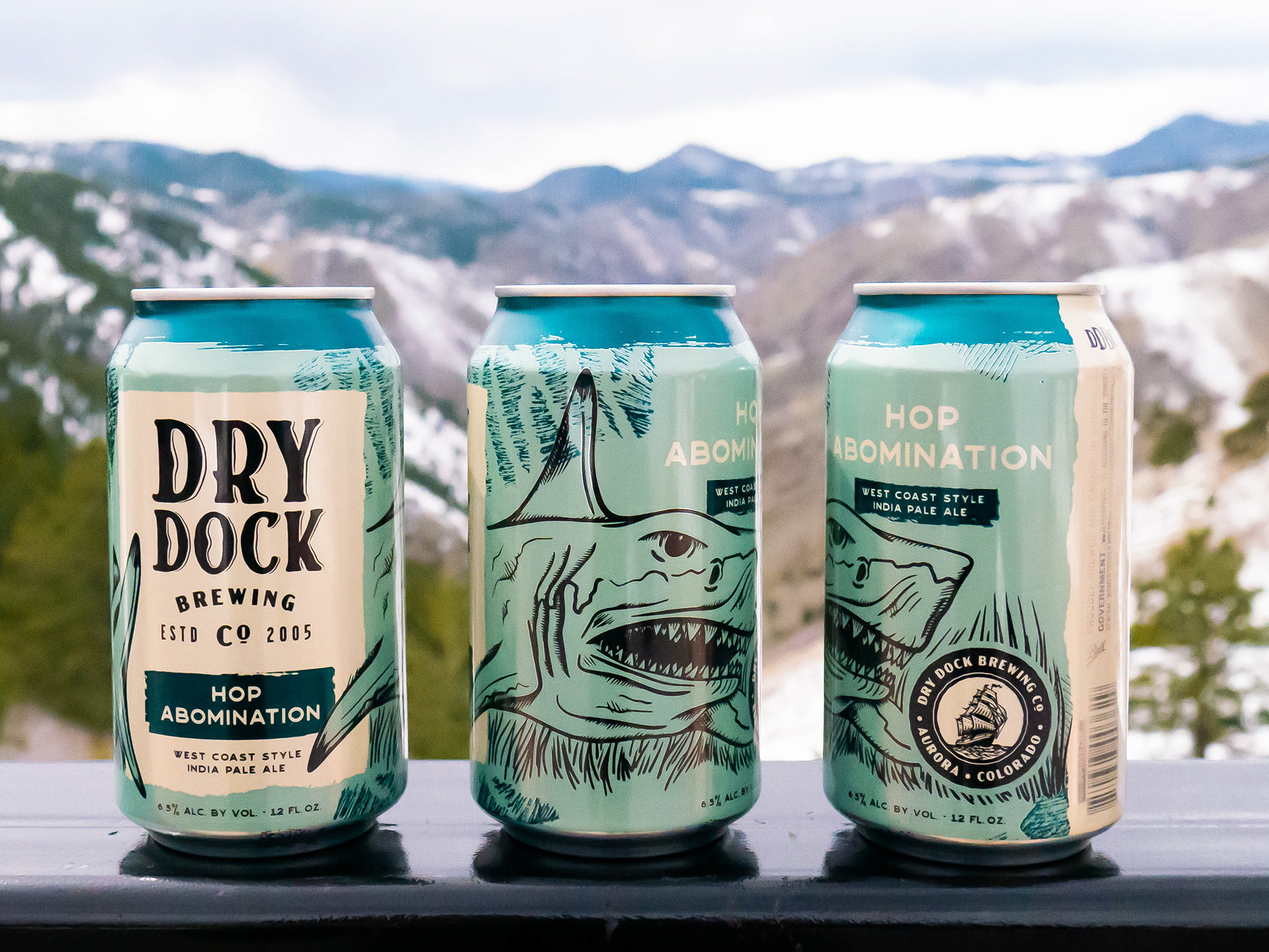
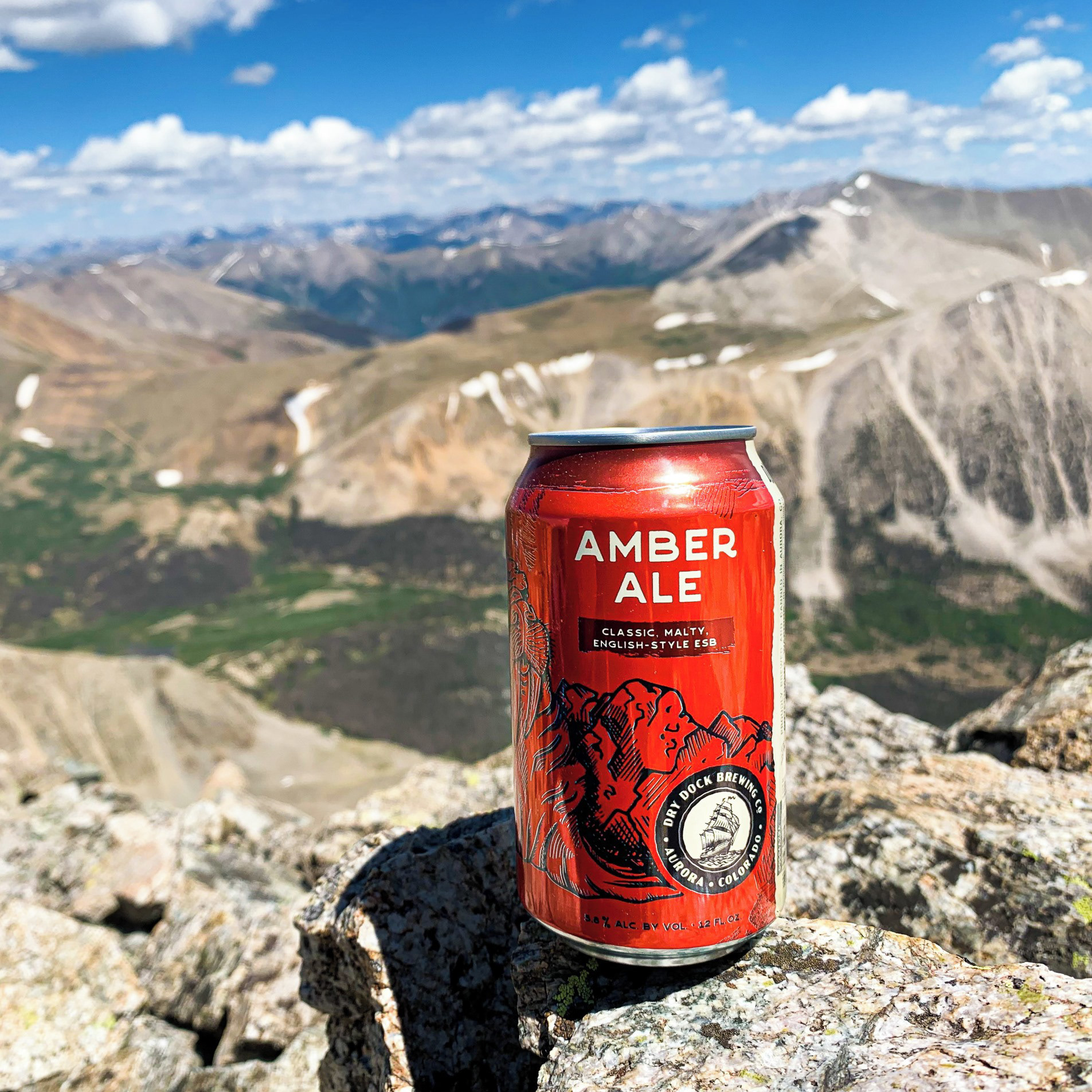
core series: a new adventure
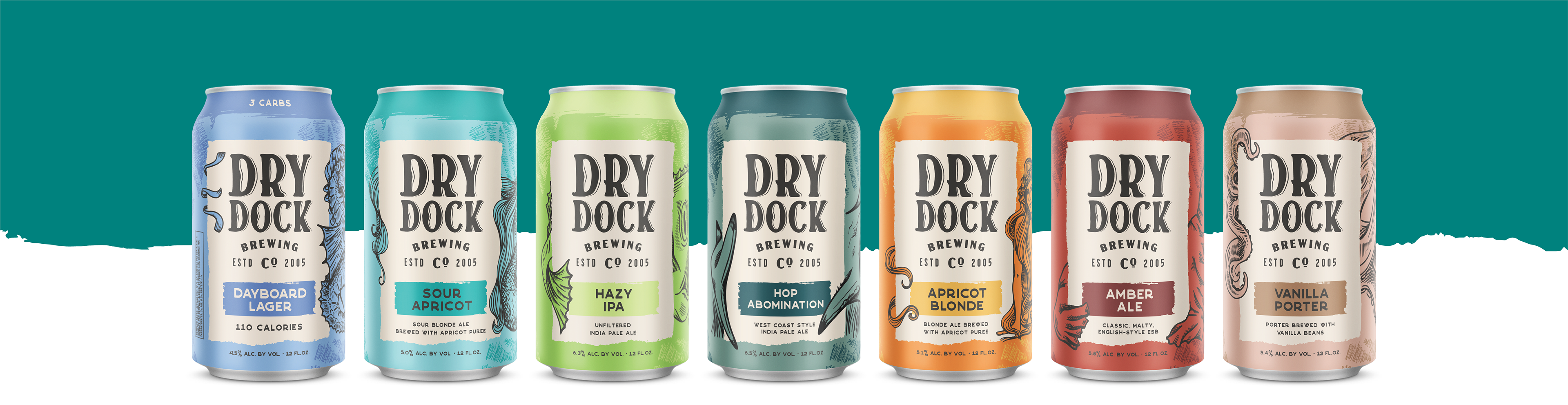
Dry Dock Brewing Co. expands and distributes outside of Colorado
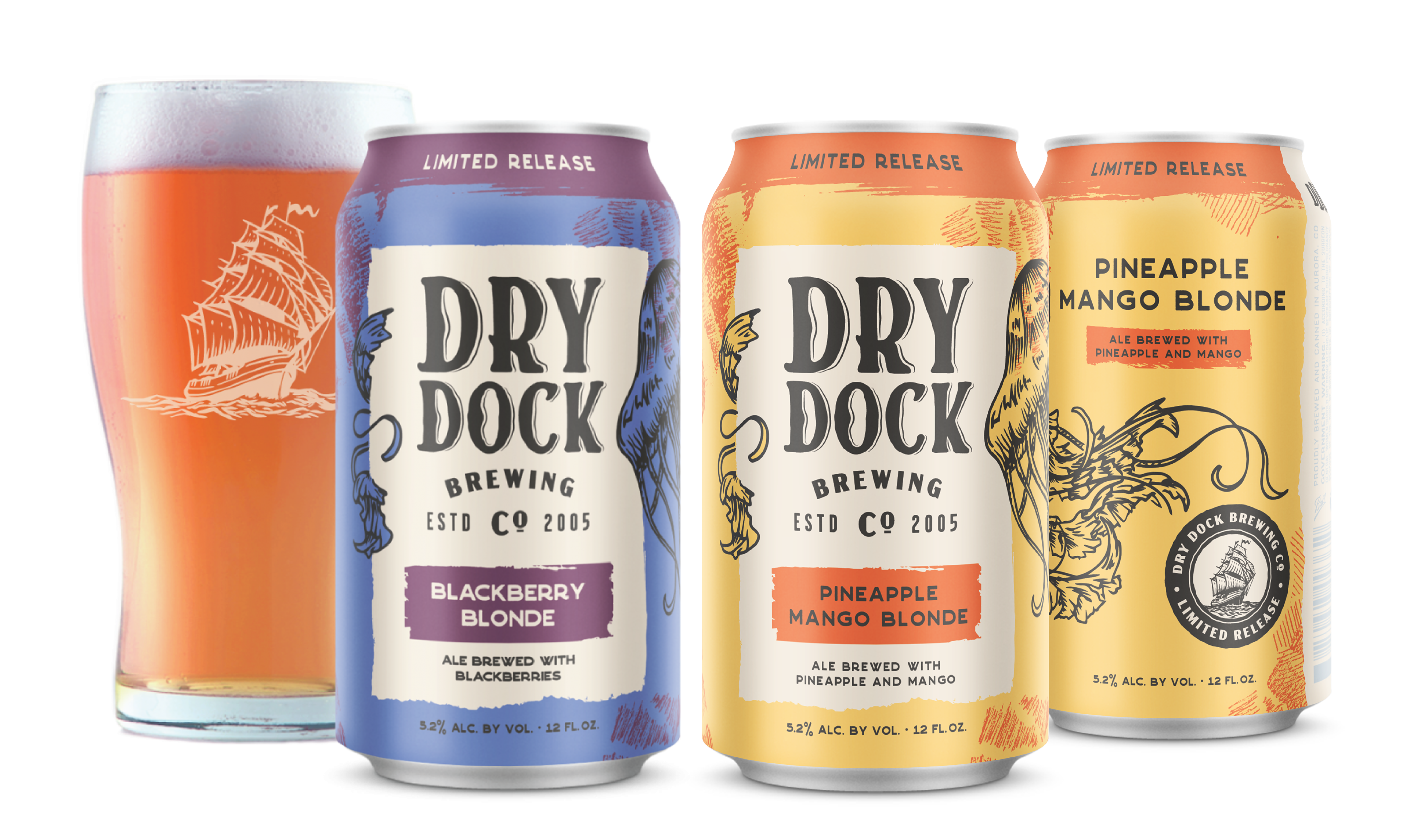
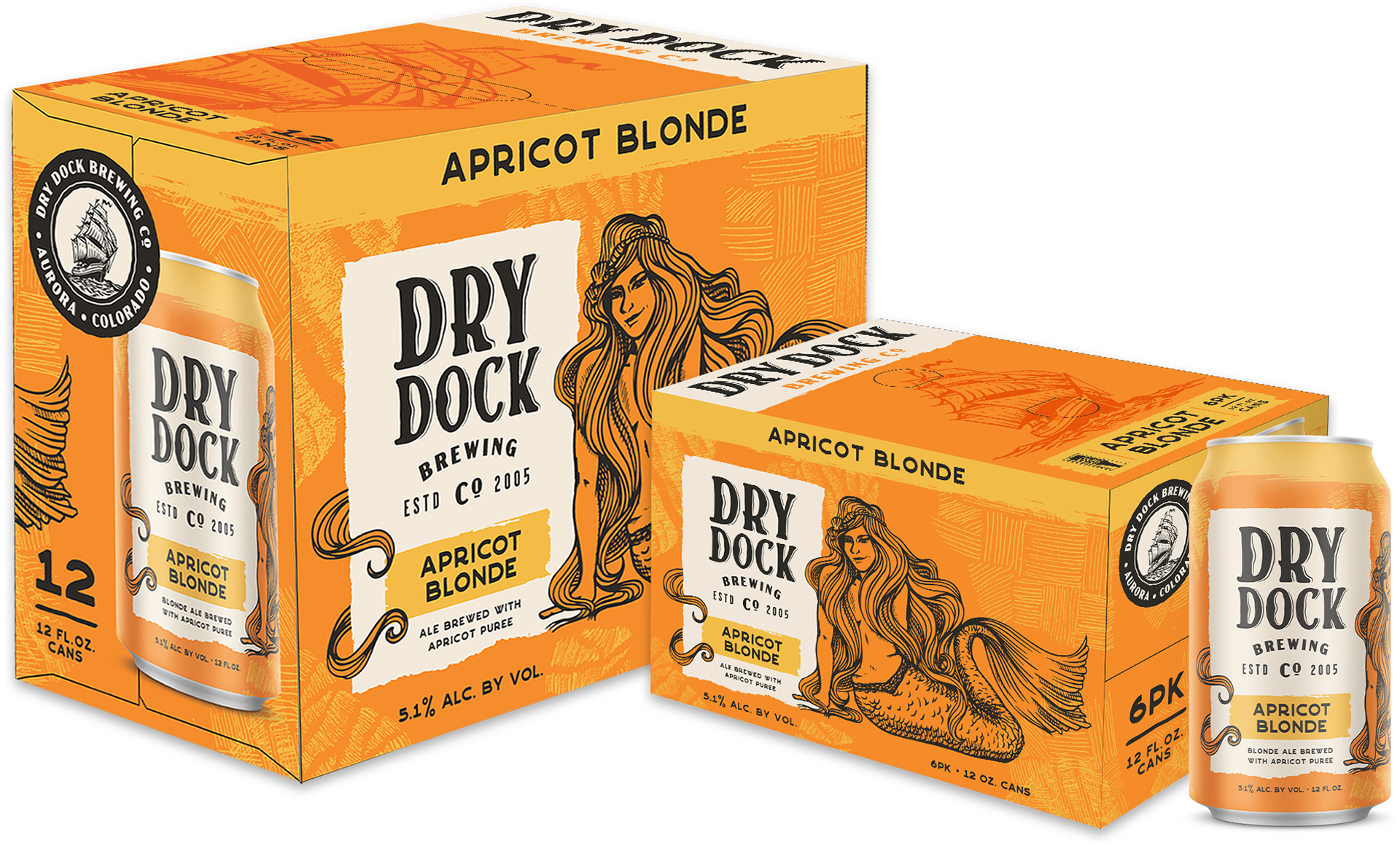
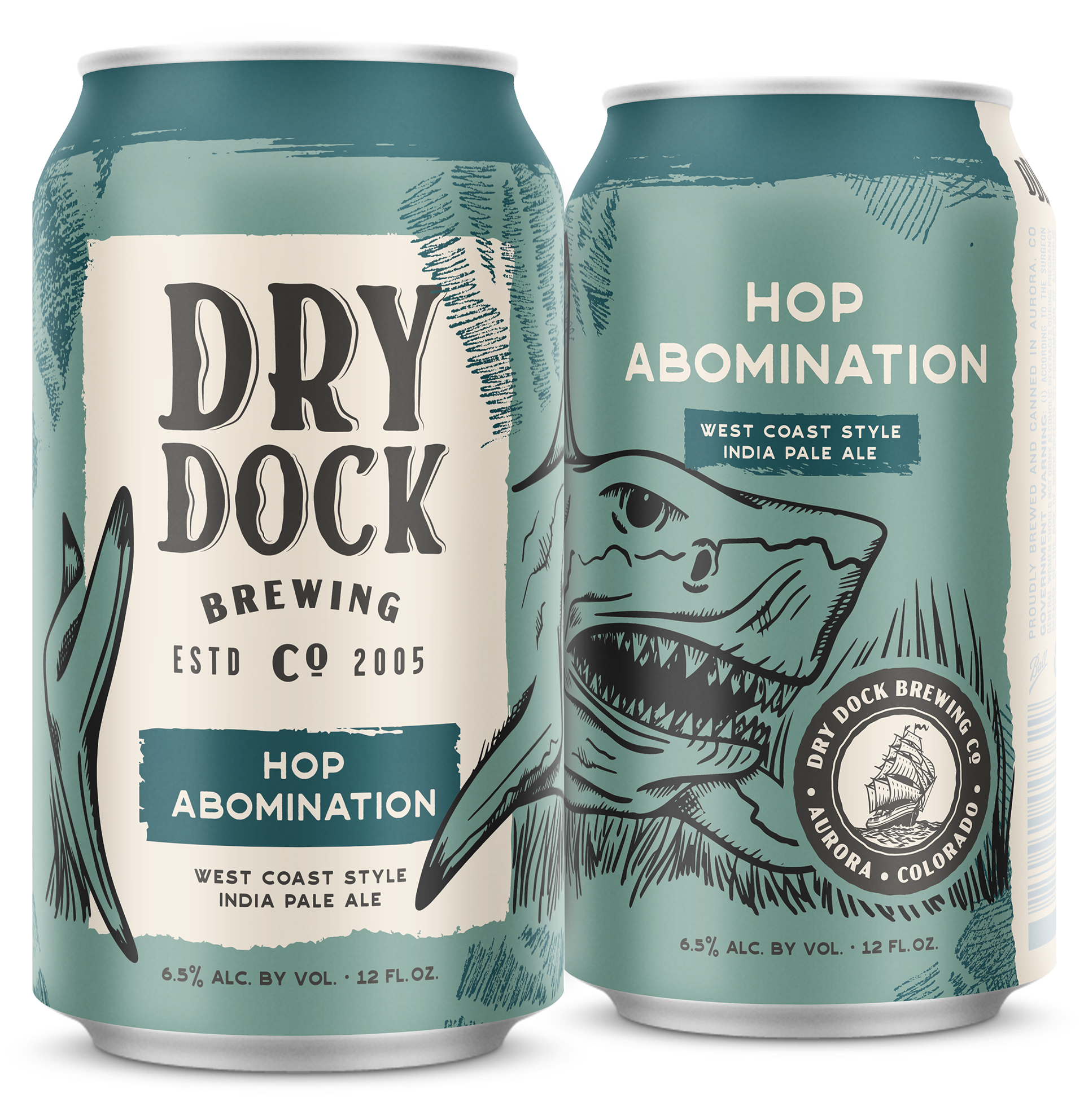
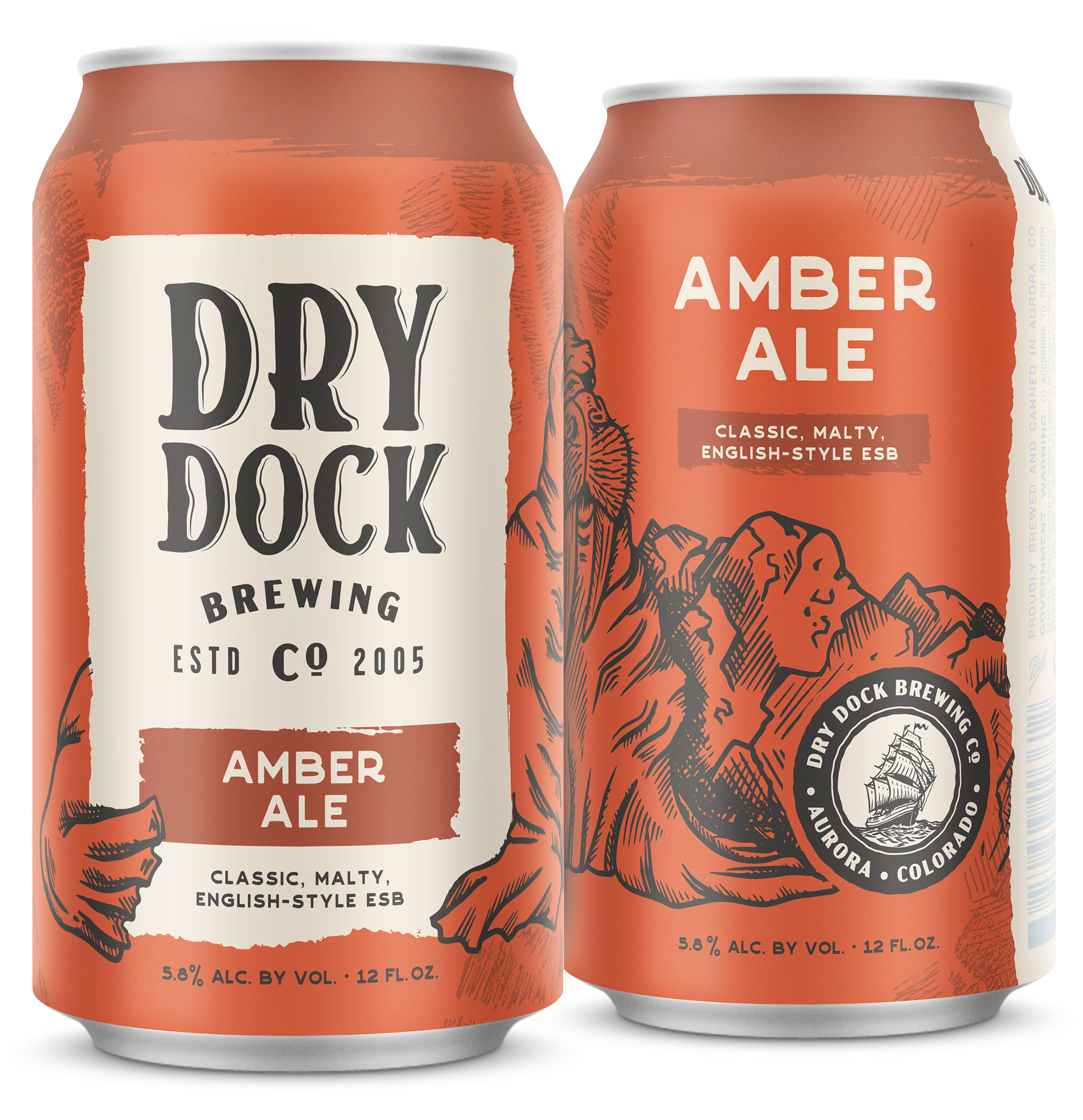
We used systematic thinking to develop cohesive packaging that allows Dry Dock Brewing Co. to have immediate recognition amongst a larger market and audience. The custom illustrations I created and bold, bright colors selected give each beer a unique identity that contrast against the natural Colorado landscape.

“...the can keeps the nostalgic feeling associated with the design (original caricature) and brings it into the future with a minimalistic touch.”
—Davidson, Scott. “Dry Dock Brewing Company Unveils New Branding & Packaging Designs.” PorchDrinking.com
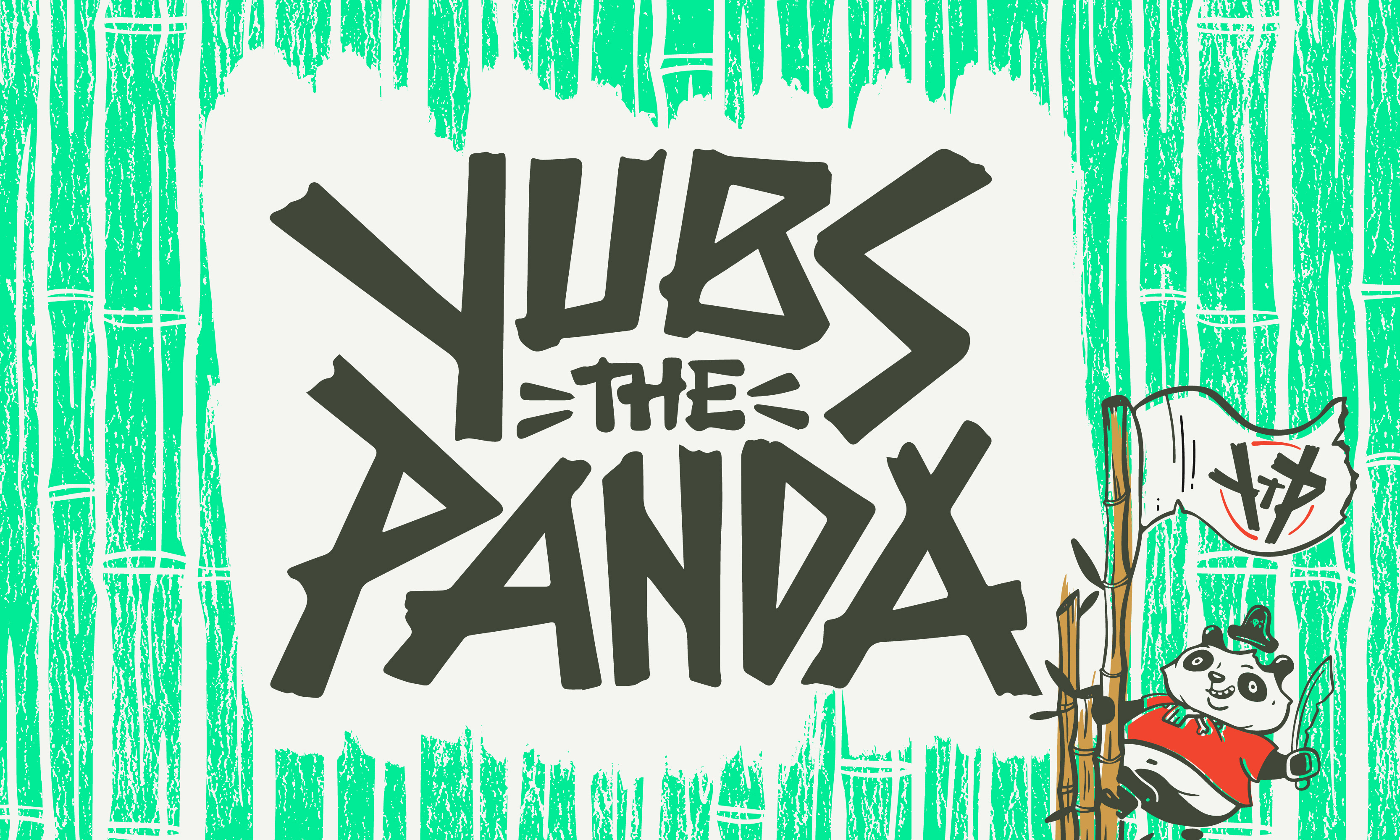
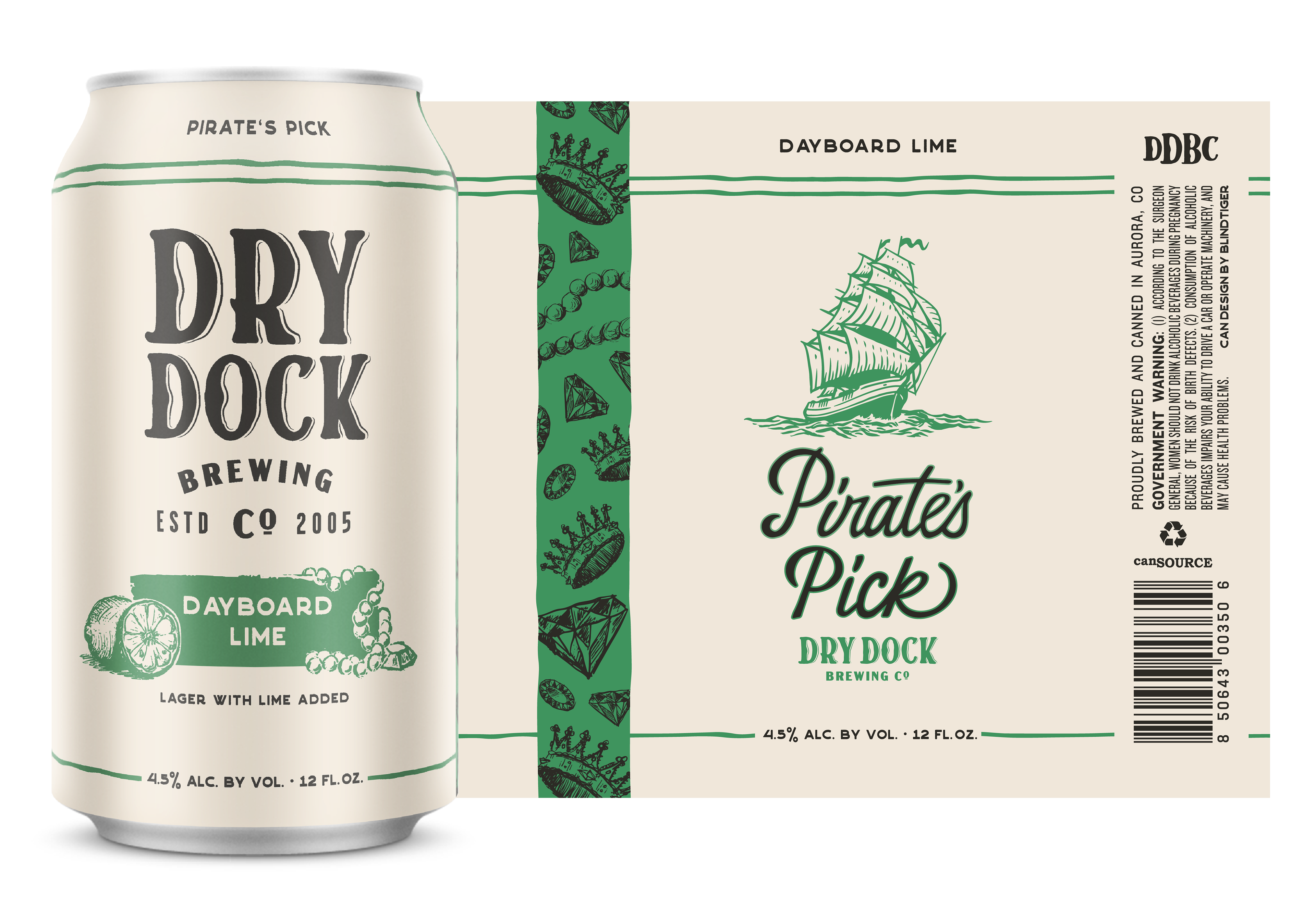
Pirate’s Pick
I created the system for the specialty Pirate’s Pick that are available only in the seasonal Booty Box. The pearlescent color of the can paired with jewel-tones make it a treasure to be found.
seasonals
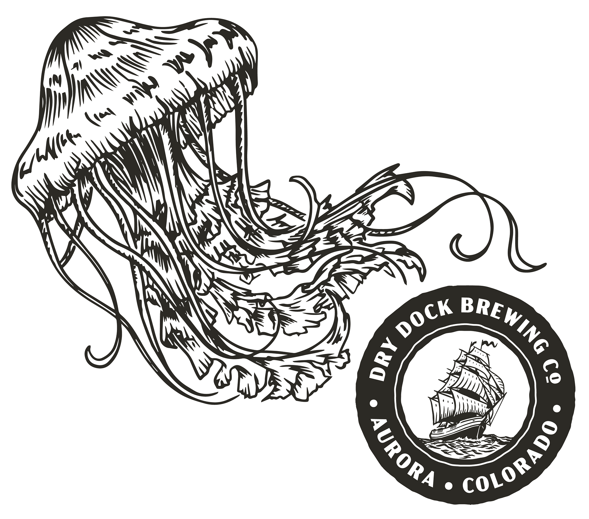
The 2020s new seasonal line-up allows the brewery to continue to meet the ever-increasing demand for fruited beers. The series is represented with the jellyfish (jelly=fruit, get it?) and changes colors based on the beer flavor profile.